2018 Feb - 2018 October
Product Detail Page Refactor
Duration
8 months
My Role
UX/UI Designer, Product Manager
Responsibility
UX research, workshop facilitation, prototyping, project management
Company
Shopee, Singapore
Project Overview
01. Objective
The team wanted to refactor the existing mobile product detail page for South East area customers to get better user experience.
02. Role & Deliverables
Not only an end-to end UX/UI designer, but also as a PM to manage project and follow up tasks.
03. Challenges
This project had quite a few technical dependencies with other teams & products, we also needed to deal with many prioritizations to make sure we can deliver MVP on time.
04. Outcome & Impact
We launched the MVP in 3 months that increased our overall metrics significantly, especially it increased the users satisfaction, decrease drop-off rate and page rank. We also received a lot of positive feedback from users.
Background
In order to help our users browsing service in south east area, especially in Indonesia, there are not enough internet infrastructure to support friendly web service, we have to make it better.
There were some reasons that drove this project:
- Business: We wanted to reduce the drop-off rate of web pages, and increase discoverability from Google search.
- Technology: The previous app design and architecture was difficult to fit low-bandwidth internet environment like Indonesia. It need to load a page around 11 seconds.
- User’s pain points: There is too much information for many South-east-Asians use the older smartphone with small screen size. A lot of our users in Indonesia are hard to filter the more meaningful thing they care.

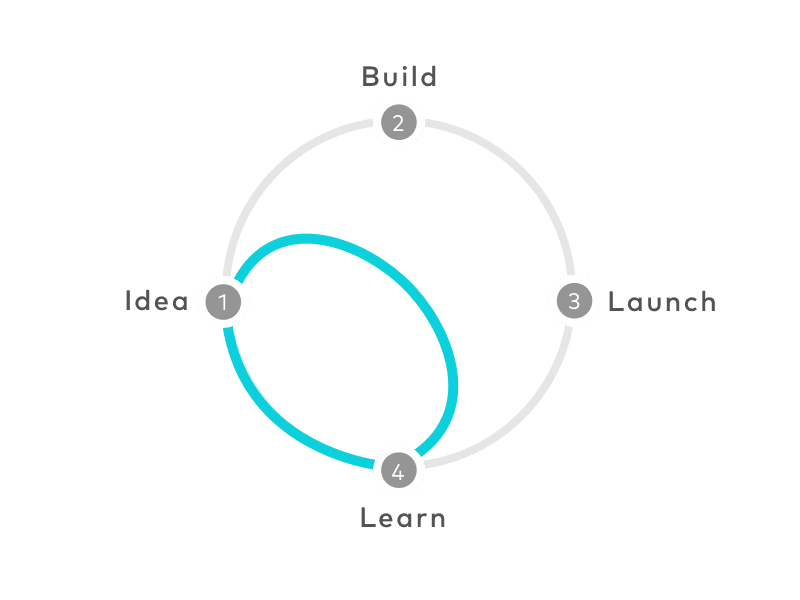
Design Process
01. Research
Data Analytics, user survey
02. Design sprint
Workshop: user discovery, solution discovery
03. Execution
UX/UI design, prototype, project management
04. Validation
Google analytics, NPS
01. Research
Data Analytics
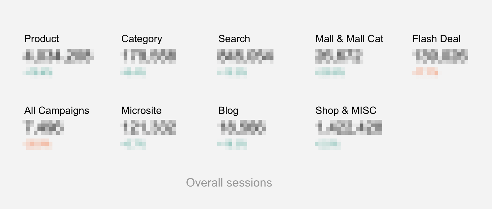
Via Google analytics, we pick some statistics up and figure out what might be helpful to measure success and pain point.
There are some data we might track or enhance:
- Page traffic
- Bounce rate
- Page load time
- New users sessions
- Average view time
Base on the above data, we found the product page which has too long load time, high bounce rate for lots of new users than other pages. In E-commerce, the product page is the one of the most important pages for conversion rate. So we decide to improve this page for higher priority, and also make a product roadmap to summarize that maps out the vision and direction.
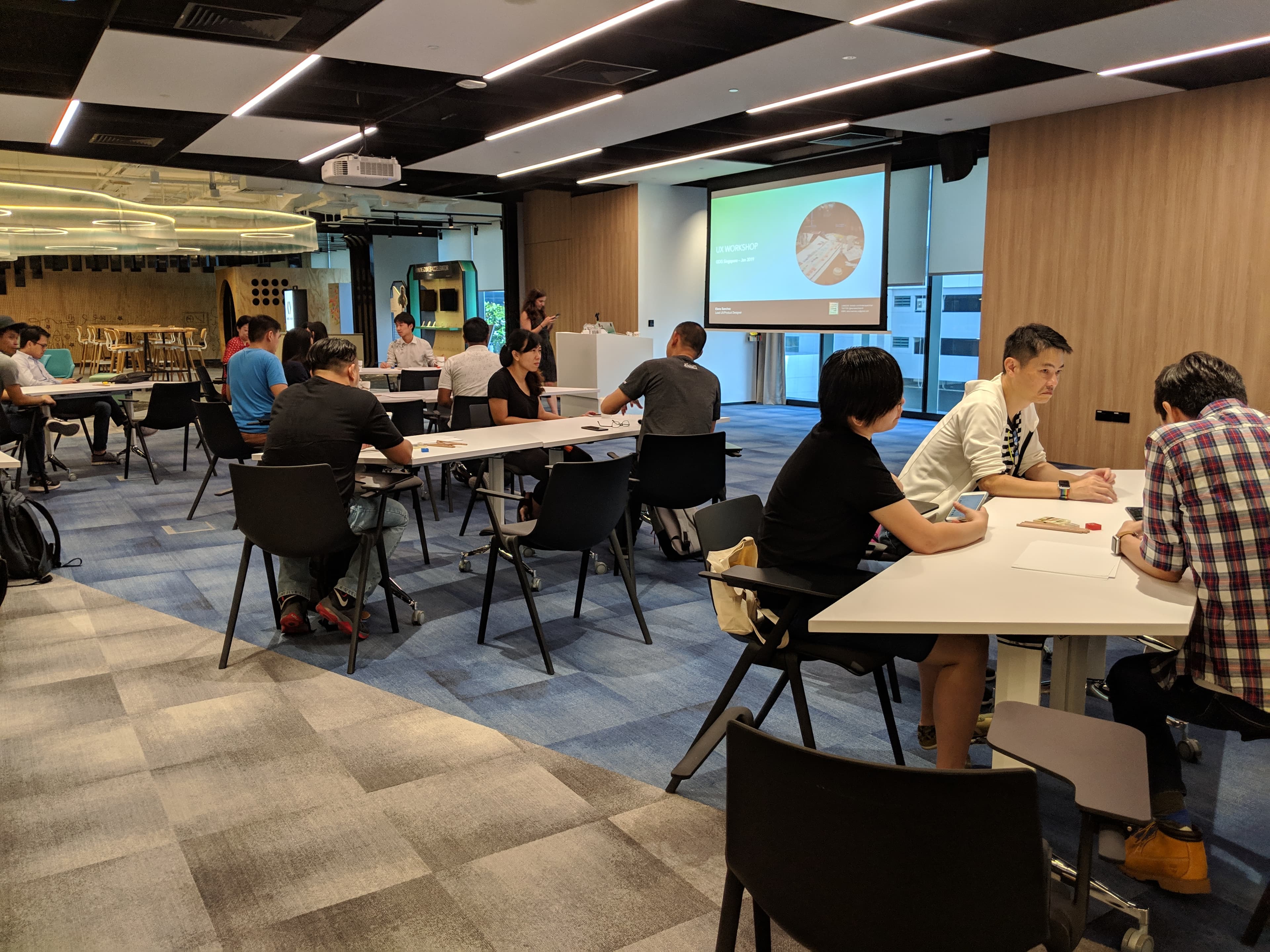
02. Design Sprint
The sprint is a five-day process for answering critical business questions through design, prototyping, and testing ideas with customers. Developed at GV, it’s a “greatest hits” of business strategy, innovation, behavior science, design thinking, and more—packaged into a battle-tested process that any team can use.
Working together in a sprint, you can shortcut the endless-debate cycle and compress months of time into a single week. Instead of waiting to launch a minimal product to understand if an idea is any good, you’ll get clear data from a realistic prototype. The sprint gives you a superpower: You can fast-forward into the future to see your finished product and customer reactions, before making any expensive commitments.
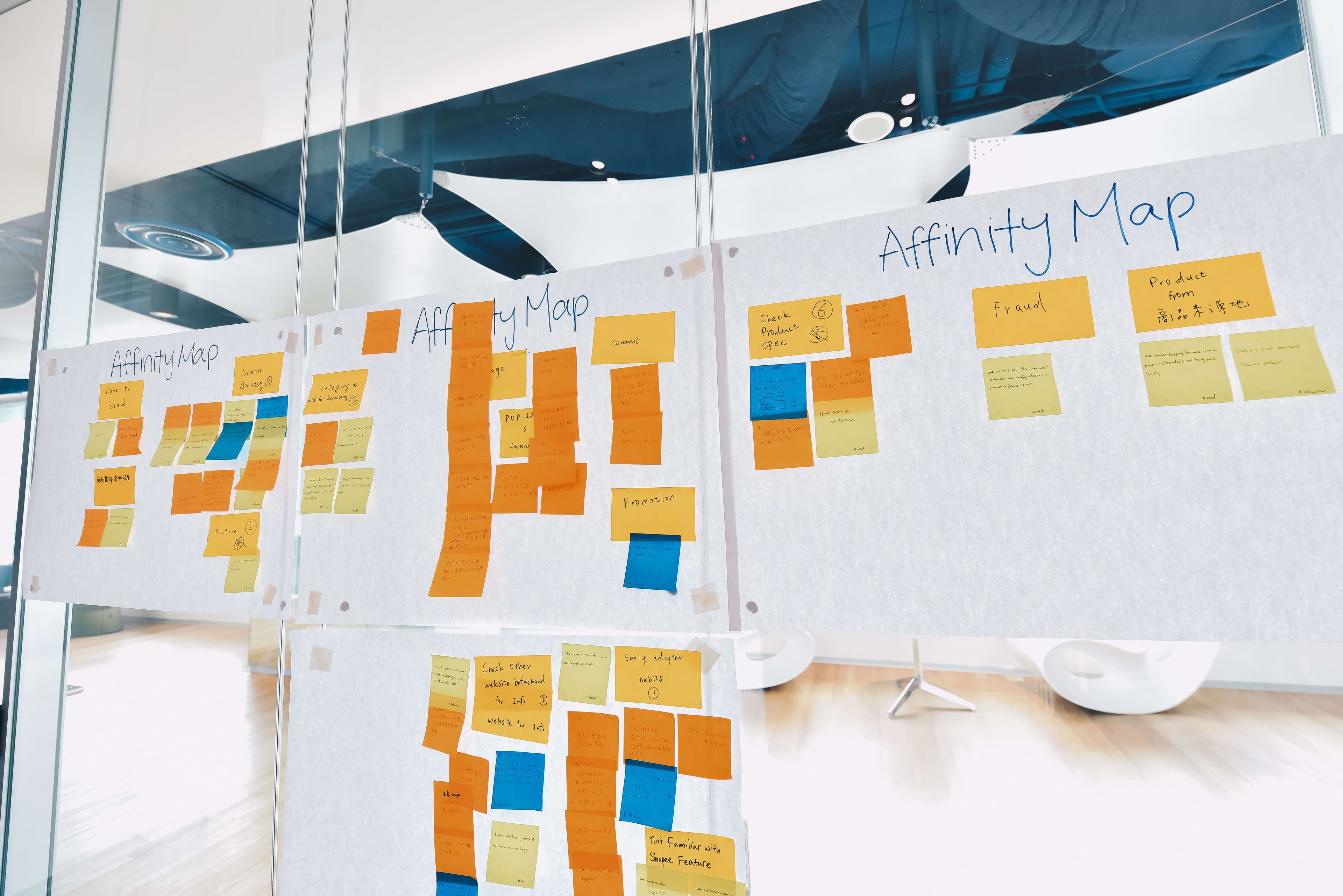
Affinity Mapping
Each participant watched user interview videos from 1 of 6 different user segments and came prepared with their observations written on post-it notes.
Affinity mapswere then used to organize and categorize these many different data points, from which common themes and relationships surrounding the observations emerged — even uncovering previously hidden ones.
Solution Discovery
The second half of the day focused on devising a design that met different user groups’ needs. To do this, participants were regrouped so each group had a mix of user personas.
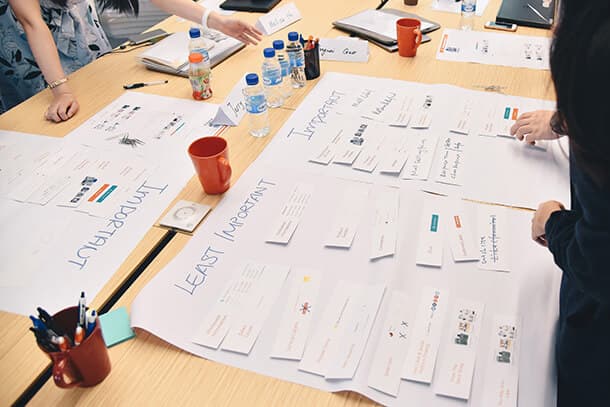
Card Sorting
Teams were given cards with components of Shopee’s digital interface and tasked to first classify, then sort according to importance. The open card sort method allowed participants to explore each others’ conceptions of user mental models. From this, teams were able to organically determine their design guidelines for the next phase of the sprint.
And here is the output:
- Product image
- Basic product information (e.g product name, price)
- Product details
- Comments sections
- Rating section
- Shipping details
- Promotion information (e.g voucher)
- Seller info
- Wholesale details
- Recommendation
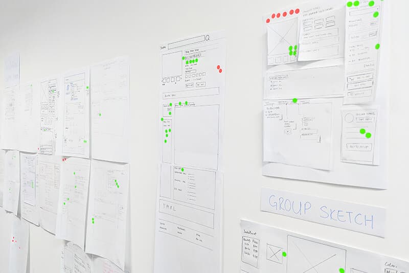
Sketch Storming
Participants first put pen to paper and individually sketched their ideal product, then sketched a single mock-up as a group. The insights that emerged from the diverse set of participants will no doubt be invaluable to future product development and innovations.
03. Execution
Base on the sketch storming of design sprint, we could start from product detail page. My goal is to solve all the problems and implement the idea of design.
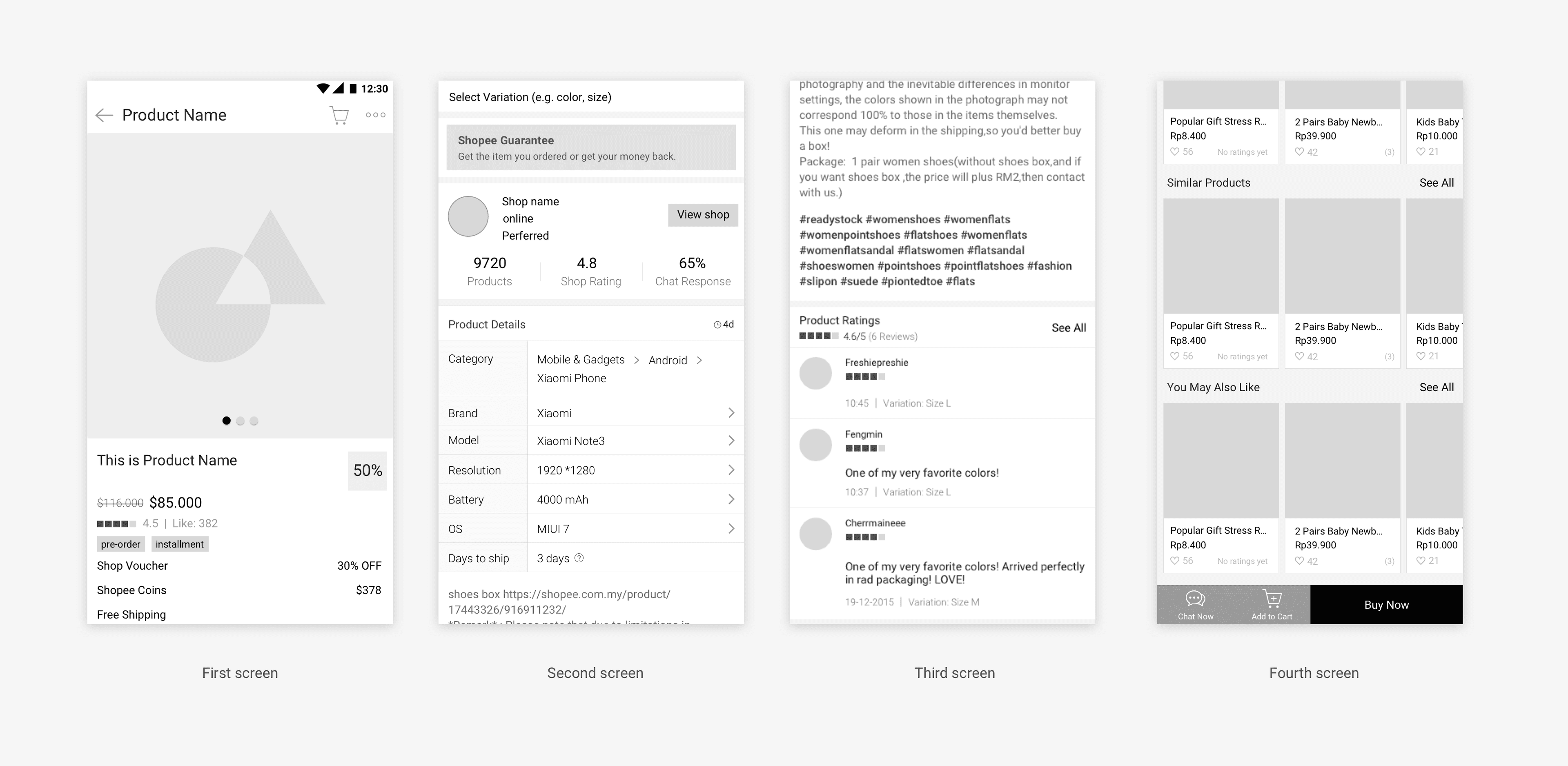
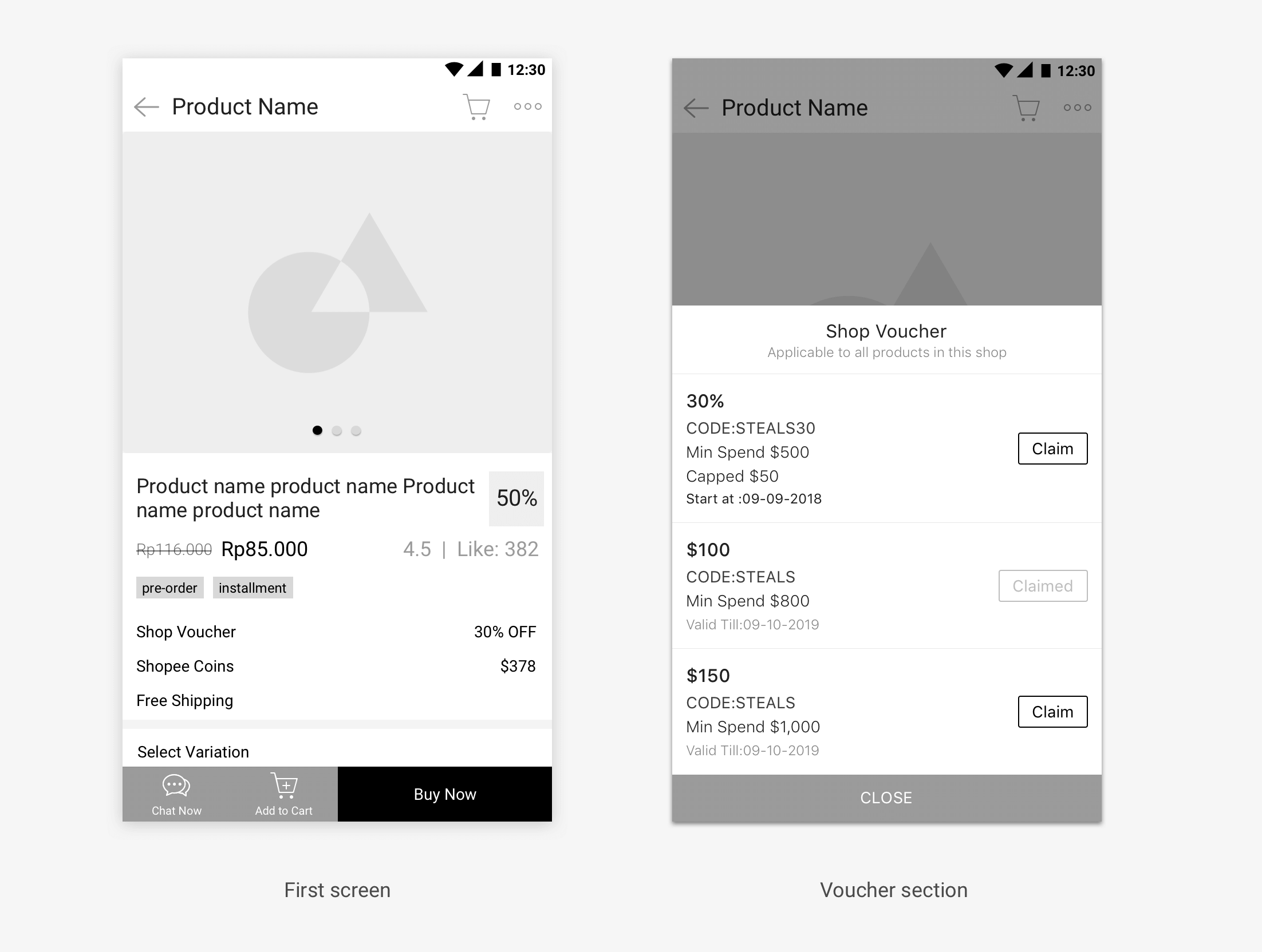
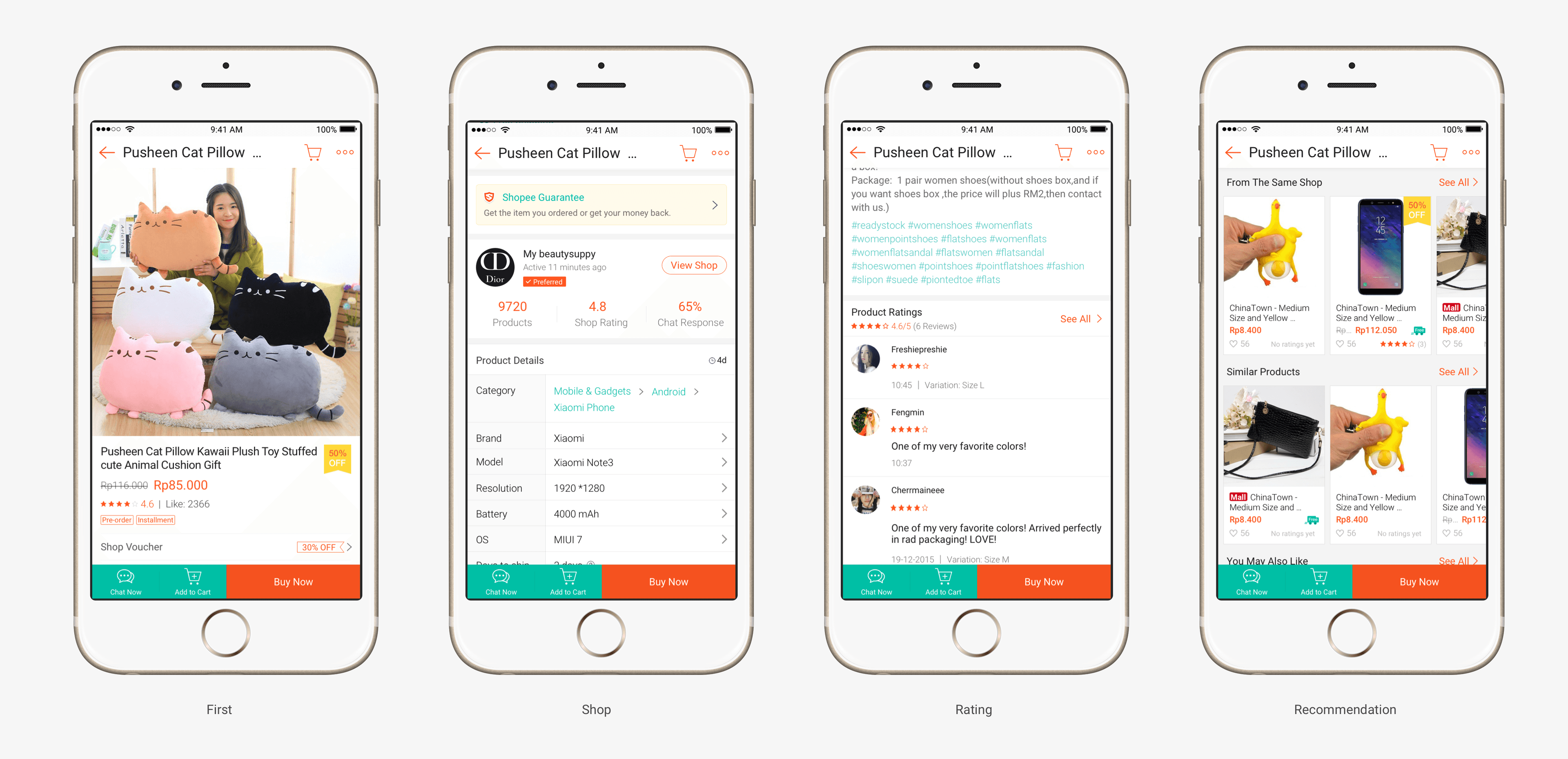
First Screen
According to the card sorting and user survey, beyond the images, product page needs to give high-level information of the product right off the bat.
That information includes:
- Product title
- Price
- Features and components
- CTA
- Customization options
Ideally, all of this information lives above the fold. That isn’t always possible (in fact, it is rarely possible). The solution here is to extraction the most meaningful wording of each service. Like voucher, via interview survey, there are few people need it, but which they actually need. We make it as a small block, only display the discount percentage, if they really like to know in detail (expire date, min speed, capped), they can click to see more in detail.
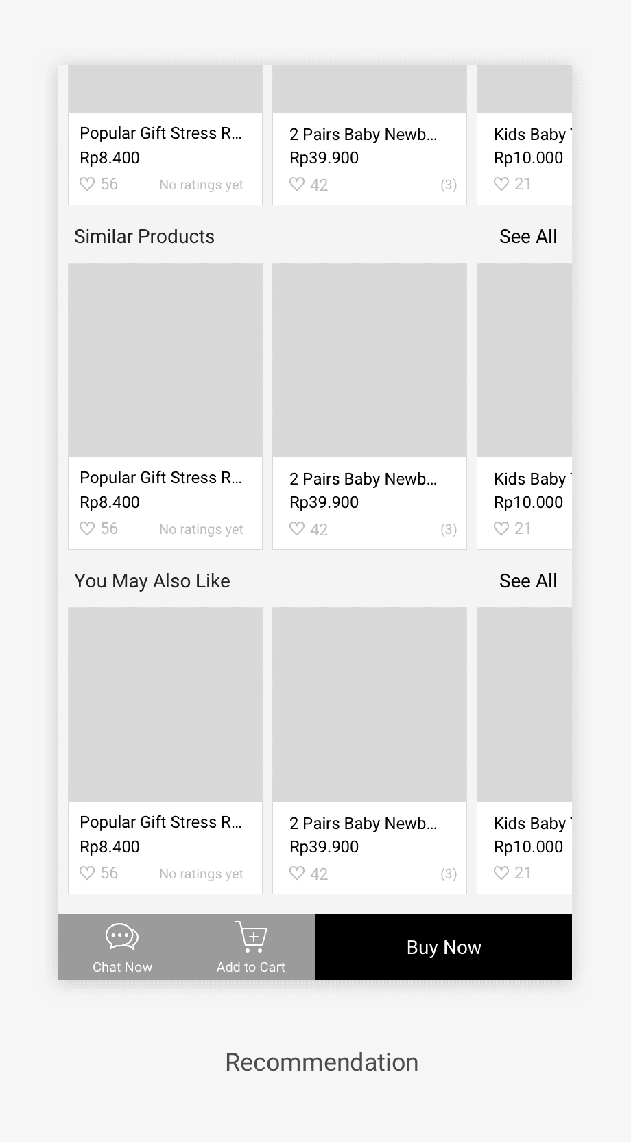
Fourth Screen: Recommendation
There are 3 recommendation sections, We put these under the product information, it can help users find out more ideal, similiar, cheaper products. For You May Also Like section, it relate the users browse history and current product, make people more choice.
- From the same shop
- Similar products
- You may also like
Visual Design
Instead of using heavy text for an overview (this is *not* the description), we use colors, fonts, and icons. And we could only fetch some representative signal for that information.
Technical solution
Via workshop with Google, we launch the AMP project for this version which is an open-source initiative aiming to make the web better for all. The project enables the creation of websites and ads that are consistently fast, beautiful and high-performing across devices and distribution platforms.
In a highly competitive e-commerce market, it’s critical to provide the best user experience for customers, including for those using low-end smartphones on 3G or 2G connections. As Shopee mobile traffic grew, the company saw an opportunity to acquire new users and improve mobile conversions through this valuable channel.
Product Management
Due to this project was new and start up with designers and developers for the beginning, I raise myself to be a product manager in this project to work with each team:
- Design team
- Product team
- Front end developer team
- Backend developer team
- SEO team
- QA(Quality assurance) team
- Local country team (7 countries)
Documentation
I created and maintaind some documents like PRD (Product Requirements Document) containing all the requirements to a certain product. It is written to allow people to understand what a product should do.
- Product Requirements Document (PRD)
- Tracking point requirement
- Design spec
- Test case
04. Validation
We use Google Analytics and NPS (Net Promoter Score) to track the performance with internal data to validate the result.
3 months after launch, product detail page continued to have a positive impact on the user experience:
- User satisfaction increased significantly 14%.
- active usage of 28 day for pages increased by 50%.
- Organic traffic incrase 39%.
- Loading time runs 3 times as fast as before launch.
For confidentiality reasons I have omitted the actual values for these metrics.